“I don’t remember it looking like that.”
By Tracey Maras
The sunset is brilliant! The colors are spectacular! The sky is filled with the dance of so many colors. You quickly snap some photos to capture the moment, thinking to yourself about how you are going to create a painting to memorialize this moment.
But when you look at the photo, you realize this is not how it looked. The colors are all wrong. And where are all the nuances that made this moment beg to be painted?
While cameras are becoming increasingly sophisticated, they are not as sophisticated as our eyes and our brain. Cameras struggle most in the presence of bright light and dark shadows. They will tend to push the light too light and the dark too dark. This results in our dramatic sunset having blown-out white areas in the sky and black silhouettes.
In addition, the camera tends to distort colors, shifting the scene towards cooler hues. The luscious yellow/orange tones of a sunset our eyes perceive can be depicted as a harsh yellow/green in the photo. And the myriad shades of green of leaves shift to a uniform, flat blue-tinged green.
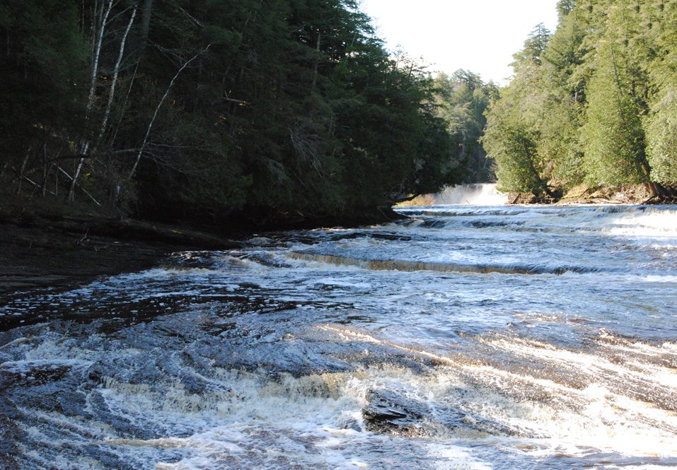
Regardless of the scene, cameras can have difficulty balancing the extremes of light and shadow and with color accuracy, as is evident is this photo I took of a river on a sunny day. The sky was a brilliant blue, but appears nearly white in the photo. The trees on the left bank are pushed to near-black in the shadows. And the leaves of the trees on the right bank, well, the colors in the photo were just not right.
For those who are tech-savvy, post-processing software can be used to “stack” and combine images to correct the lights and darks. The software can also correct color distortions. But ultimately, the camera will never be able to capture your true experience.
As artists, what are we to do?
First and foremost, we must recognize the limitations of cameras. If we simply copy a reference photo, our painting will convey the value and color distortions that were recorded in the original photo. Awareness is the first step.
The next step is observation. Since our eyes and brain are truly the more sophisticated apparatuses, rely on them. Spend time observing. Analyze what is in front of you. Notice the nuances of color and value. And better yet, pull out your pastels or paints and do a quick color study. Even if it is just making little swatches of color.

You can always use that reference photo as a reminder of the composition. But use your eyes to record those colors that took your breath away.
This article was originally published on www.traceymaras.com. It has been re-posted here with permission.